
We believe the best advice is personal, scientific, and beautiful.
As we embark on an evolution of the AdvisorEngine product offerings, these three ideals continue to drive everything we do. We want to give you some insight into the product design journey here at AdvisorEngine.
It is crucial to get a shared understanding before diving into how these three broad concepts apply to design at AdvisorEngine.
Personal
We begin with the advisor-client relationship and work outward from there. The best advice is deeply human – it begins and ends with people.
Like any good relationship, it takes time to develop trust and credibility. You'll hear a consistent theme if you ask one of the 1,000+ RIA firms we work with – our partnership approach is a key differentiator.
This partnership mentality also makes its way into the product design. Over the last year, we've assembled a design team that shares common design practices and can broaden the reach to build more with you, our clients. We have gained valuable insights into the challenges you face using the software and quickly validate solutions through our product design sessions.
At the core of our design process is the human-centered methodology. Put simply, you, the client, helps shape the product. This partnership with our clients allows us to hone in on the important features and initiatives, building the products to help you take your business to the next level.
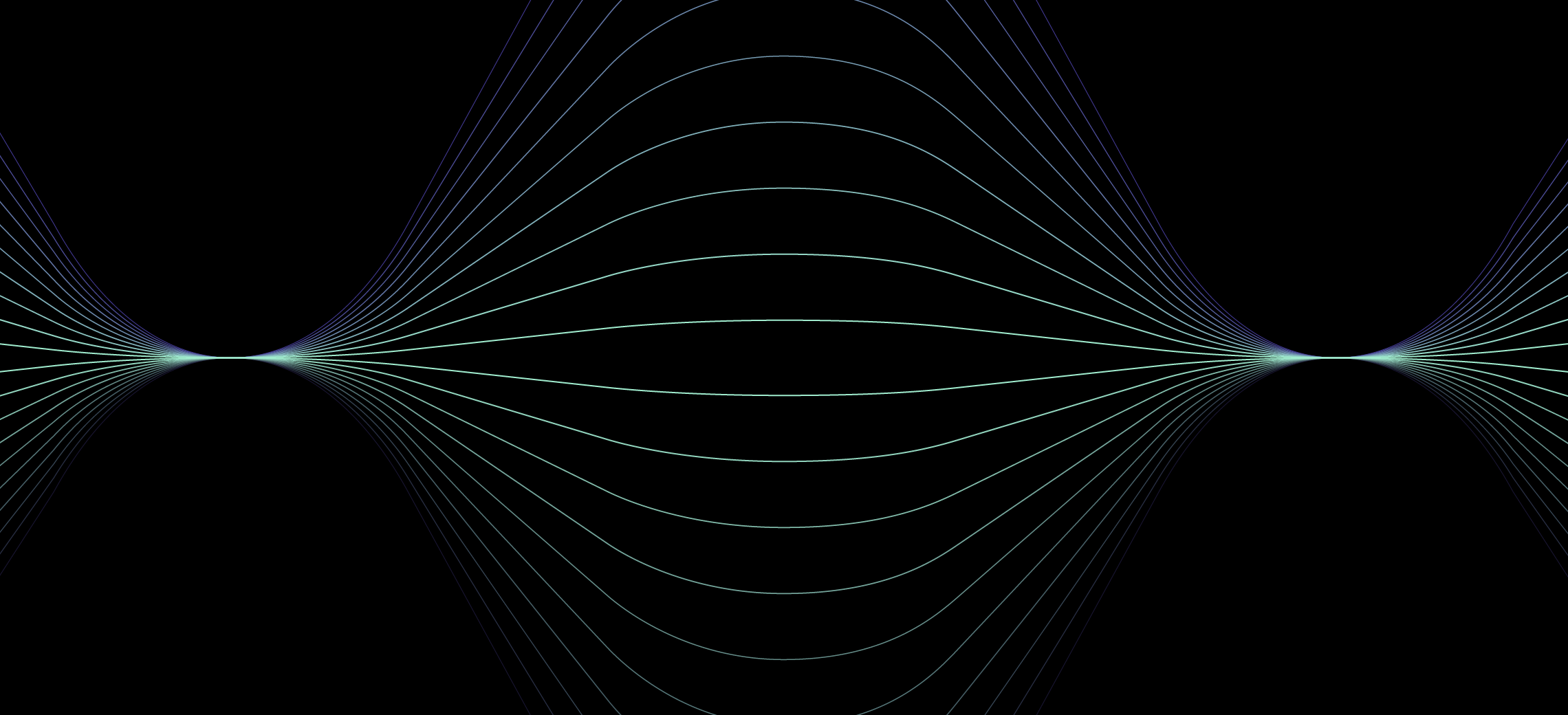
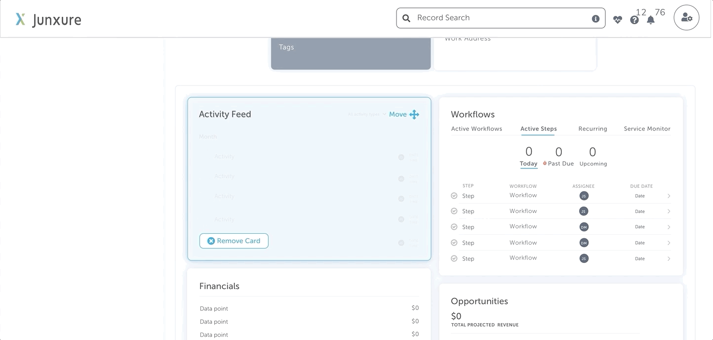
You'll notice several studies the team performed around elevation or the level an object sits on the page in the examples below. It was vital for us to have the interface communicate hierarchy as this was lacking in the current experience. The higher the elevation, the closer it is to the user, the lower the elevation, the least important. We wanted to invoke a sense of harmony, order, and flow. How might we make the interface feel more personal?
A key decision point centered around the use of shadow, and although it may seem like a minor detail, it helped bring it all together in the aha moment. We first used Google's Material Design Elevation system. Although we found this to be a great system, it felt a little harsh and not very personal. As a result, we toned back the shadows and made them a bit softer and lighter and a little more approachable. We went with a softer radius which felt more inviting, engaging, and warm.
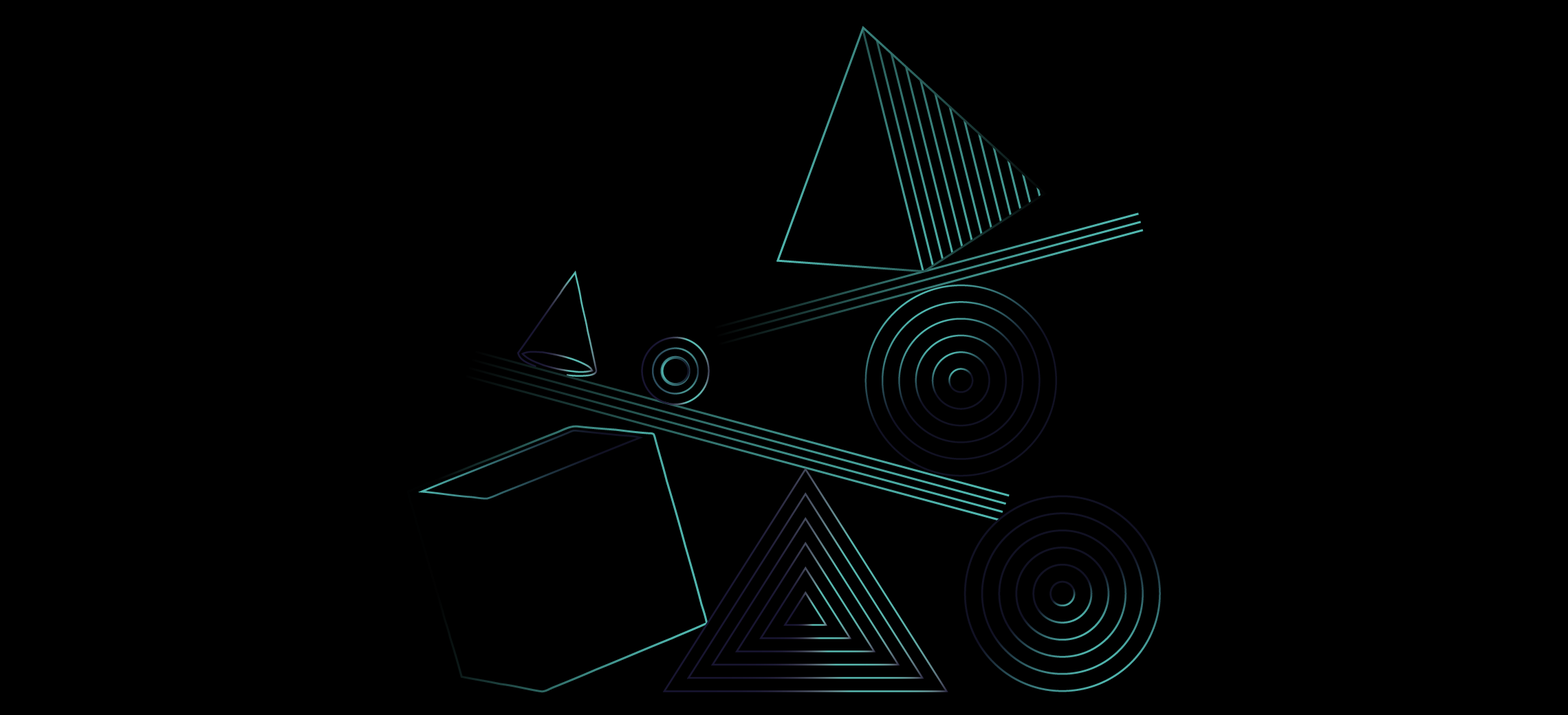
In the updated product, there are instances where UI elements change elevation based on the user's interaction. It's like a good conversation with a friend; there's a natural flow of response.
We felt there was a huge opportunity to update the visual cues that suggest changes in status or natural ways for the interface to provide feedback. The obvious benefits here are a deeper and more natural way to interact with the interface. It removes ambiguity and provides a clear path forward.
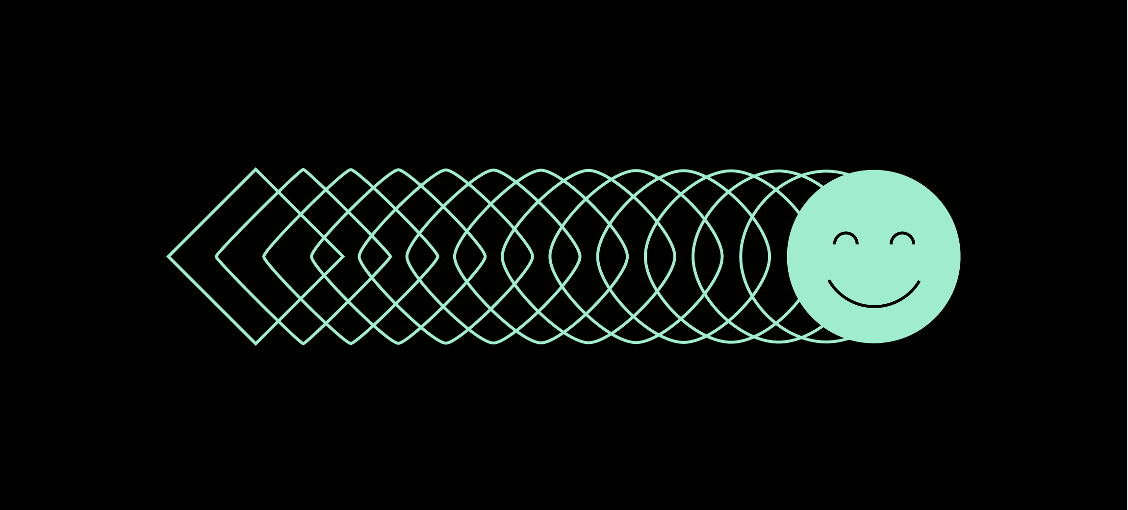
As seen with the following example, when working through a configuration interaction, a client will have immediate feedback when moving objects from their dashboard window. The result feels personal because the interface is naturally responding to your action. The interface reacts to the human and provides meaningful, natural, personal feedback.
Scientific
We are always searching for new ways to understand investing and investor behavior. The best advice is informed by research, evolving based on quantitative finance, behavioral economics, business analytics, and artificial intelligence developments.
Design and finance share some common themes, one of which is behavioral psychology. People are motivated by different things. As designers, we often lean on best practices when responding to user behavior to build products that significantly impact the problem we are trying to solve.
“The time it takes to make a decision increases with the number and complexity of choices.” -- Hick’s Law
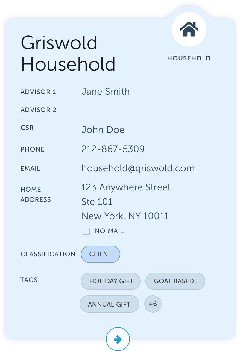
In the example to the left, we see how the team applied this principle to the new household cards. By giving you summary-level information, the user can make sense of all the data quickly. In contrast, the current experience shows everything at once without a way to customize your data view.
Gestalt laws of grouping exist because the mind has an innate disposition to perceive patterns in the stimulus based on specific rules. These principles consist of five categories:
1. Proximity
2. Similarity
3. Continuity
4. Closure
5. Connectedness
In addition to applying some of the design principles described above, we further activated the science by investing in a user testing platform that analyzes the insights you, the client, contribute.
Through AI, we will be able to gain sentiment analysis in a matter of hours, not days. We will be able to broaden our reach and do more usability studies. This platform will open the door to a greater understanding of our users' behavior and motivations and create usability studies that provide scientific, data-based evidence to drive our design decisions.
Beautiful
We are creative and design-minded, which gives our technology a distinct aesthetic compared to other firms. The best advice is inspiring.
Users do judge a book by its cover. They are more inclined to use and interact with a product that is not only usable but aesthetically pleasing.
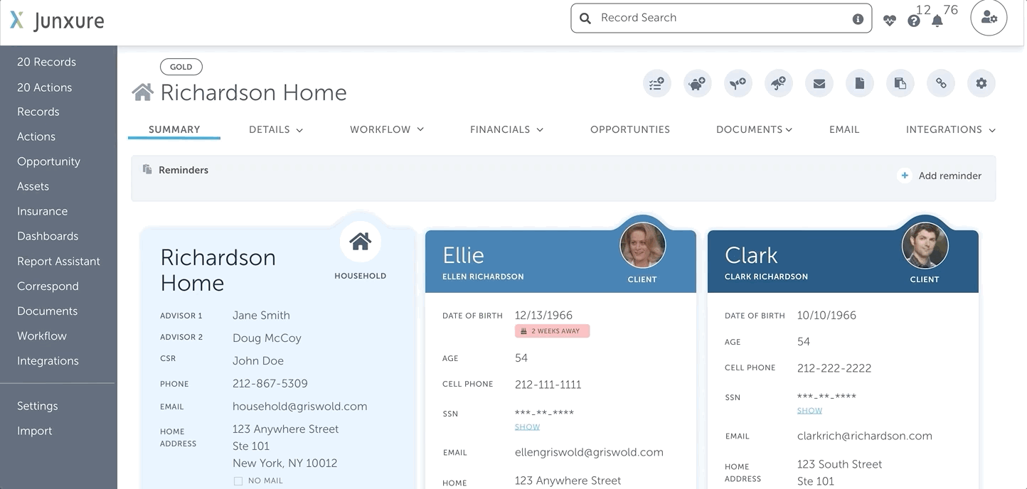
The below example shows the new design. It has come a long way, and you are just as excited about it as we are, judging by your feedback. You should be; you helped build it.
But what does beauty have to do with it? It's just a piece of software.
This phenomenon of perception is especially valid when products compared are equal in functionality and ease of use. The better-looking product will win over the users more swiftly -- first impressions matter.
This concept reminds me of Don Norman's book Emotional Design. Norman discusses how various versions of products, while they may serve the same function -- it's how people evaluate them and perceive them based on aesthetics and how it influences their decision on which product to use.
Norman's teapot story, however, attempts to illustrate the book's central argument: "The emotional side of design may be more critical to a product's success, adoption, and use than its practical elements."
Think about your favorite digital experience. How did it make you feel? With this level of craft, we design the product so that the experience is more meaningful and delightful.
A beautifully designed product will make an emotional connection with the user. People are more likely to adopt something that looks good. A product's beauty can be the very thing that makes it usable.
Taking it a step further, the inclusive design allows us to think beyond the visual expression of beauty and how that can be translated into a consumable format used by screen readers and other assistive technology. For those who rely on these tools, beautiful becomes more than just visual; it is experiential.
We couldn't be prouder of all the hard work our whole AdvisorEngine team has put into the next evolution of Junxure CRM. So far, we're overwhelmed by all the positive reviews from our current clients. Schedule a demo today to get your sneak preview.